
Apr 11, 2025
A logo is more than just a design—it’s a visual identity that reflects a company’s journey. As Tomorrow Things has grown, so too has our logo. What began as a symbol of a digital twin solution for industrial clients has evolved into a representation of a broader ecosystem—one that now encompasses our platform’s expansion into AI, automation, intelligent systems, and AI-powered apps designed to optimize manufacturers' operations and increase overall efficiency.
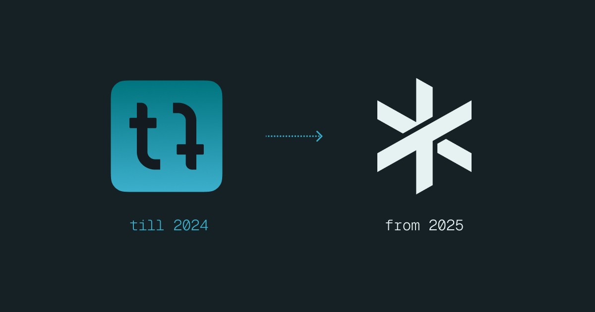
From App Icon to Ecosystem Symbol
The original logo featured two mirrored, twisted lowercase "t" characters, enclosed in a rounded square – a clear nod to the initial focus on app development. However, with Tomorrow Things' growth came a need for a new visual identity that reflects not just where we’ve been, but where we are headed.
The New Logo: Growth, Magic, and Dynamism
The new logo builds upon the foundation of the old, while reimagining it for the future. The two "T" characters are now capitalized to symbolize both the company’s expansion and the broader significance of its role in the industry. No longer facing each other, these Ts now represent the expansion of our product offering into a larger, integrated intelligent system.
The Ts form a star, a "Heavy Asterisk"—a dynamic symbol that represents the magic of artificial intelligence, automation, and the speed of progress. The slanted edges, angled in the reading direction, emphasize movement and progress.

Two Colors, Two Worlds
The dual-color design serves as a visual metaphor for the connection between the digital and physical realms. Tomorrow Things bridges these two worlds, with cutting-edge technologies that seamlessly integrate artificial intelligence with real-world systems. This connection is now visually encapsulated in the logo, symbolizing how our platform unites two diverse landscapes to create something greater.

Consistency in Corporate Design
Along with the logo, the entire visual language of Tomorrow Things has been refined. The wordmark has been capitalized and aligned to ensure it complements the new logo design. To maintain a cohesive identity across our ecosystem, all app icons have been updated.

Looking Forward
The new Tomorrow Things logo is not just a change for the sake of change. It is a natural progression, a reflection of our growth as a company and our vision for the future. It speaks to the power of artificial intelligence, the speed of automation, and our commitment to creating intelligent systems that bridge the gap between the digital and physical worlds. As Tomorrow Things continues to evolve, so too does our identity—always striving to stay ahead of tomorrow.

Join us
Are you ready to unlock the potential of sustainability through seamless digitalization? Join us on this transformative journey at Tomorrow Things. Together, let's push the boundaries of what's possible, one AI-generated blueprint at a time.


